Sherwin Williams
Sherwin Williams contracted me to revamp their online experience for HGTV.
HGTV
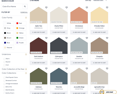
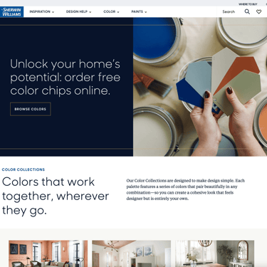
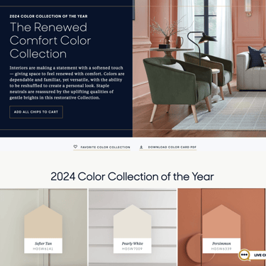
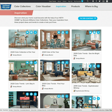
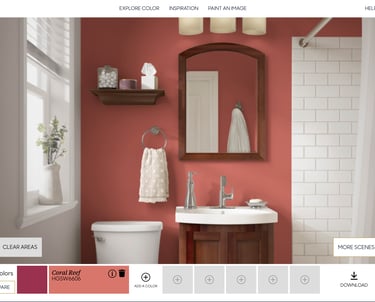
Online retail for home improvement requires a deep study into user behavior. To understand the purchase cycle we have to start at the beginning with inspiration. Fortunately, SW's line of HGTV-branded paints come in an amazing array of inspiring colors.
Before (on left), After (on right)
UX Theories
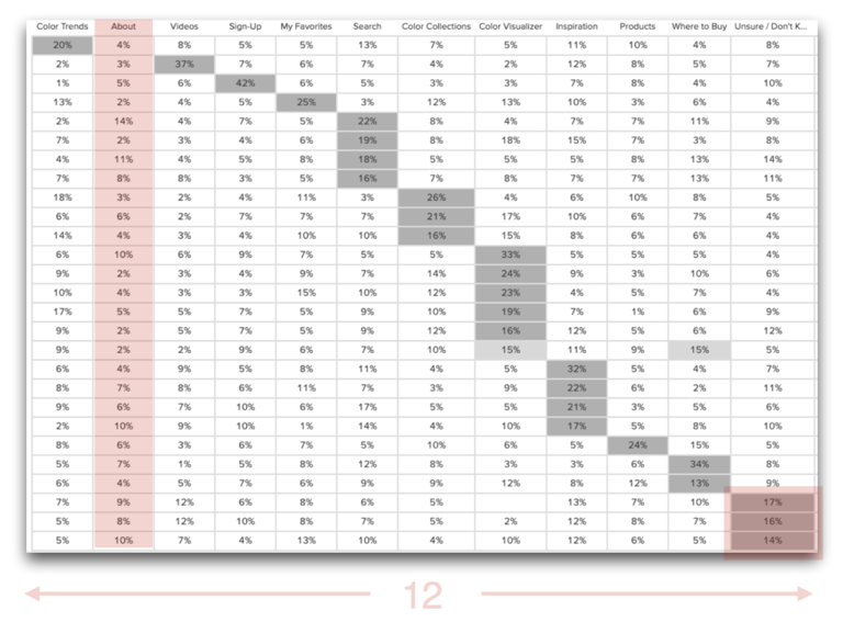
The existing user navigation was put together previously in the same manner many things are, built in the shape of the organization rather than the shape of its consumption. A quick test proved that of our 12 navigation options users had little to no confidence in any particular group of cards sorts.
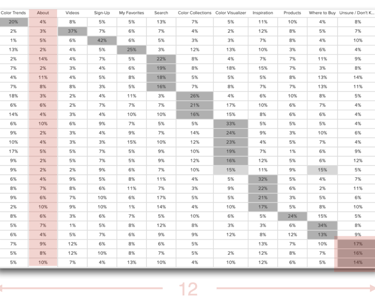
Testing (tree jack)
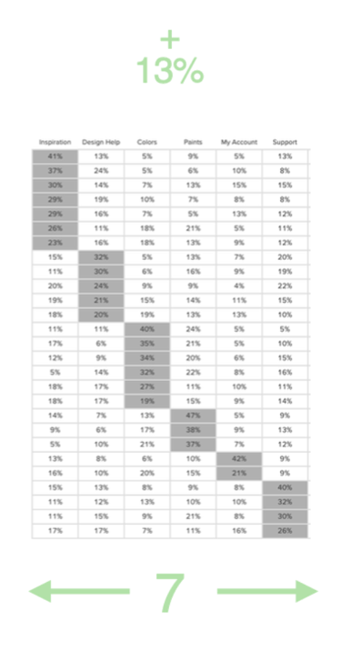
To serve up a better experience we started to explore a missing category in the user journey "design help." Also, the utility of the site was spread over 4-5 categories and seemed prime for consolidation. After several reworkings and testing of the navigation, we were able to increase user confidence by 13% globally and reduce the cognitive load of the navigation down to 7, from 12


Content Strategy
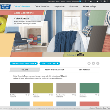
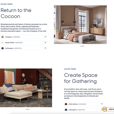
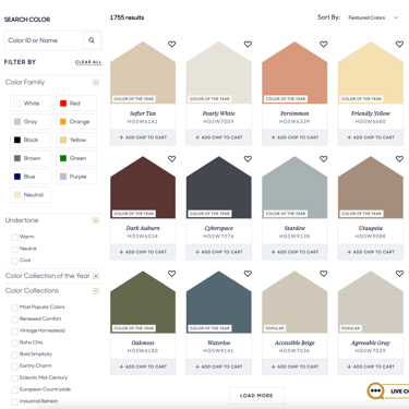
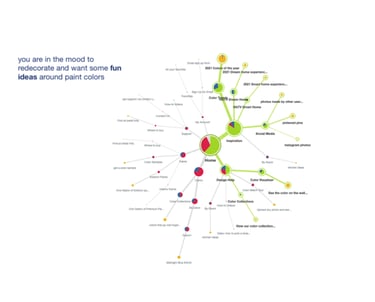
With the overall taxonomy and navigation figured out I set out to develop a content strategy that would align with users' needs along the inspiration/design help journey. With the ultimate goal of providing users with paint samples, and direct online purchases at Lowes.
Wireframes
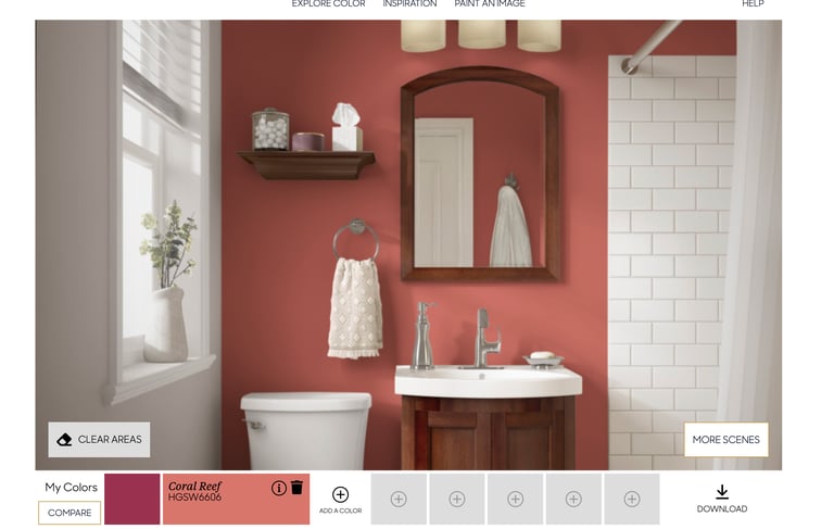
Wires were drafted to give the design a play-by-play of content needs and user interactions on screen. Several times UX collaborated with design to solve complex issues in the UI and landed on elegant solutions together. Visit Site >
Outcomes
Large corporate websites built in Sitecore RARELY come out the way a designer envisioned them originally. I have to say that the team at MONO (agency) did an amazing job nurturing this design through development with SW.